Top OpenClaw Workflows for AI Infographic and Poster Design
OpenClaw agents can produce publication-ready infographics and posters by chaining data extraction, chart generation, and layout composition skills into a single pipeline. Huashu-Design, an open-source skill with 14,800 GitHub stars, handles end-to-end infographic creation in 3 to 30 minutes. The five workflow patterns covered here range from single-skill chart generation with ChartGen to multi-skill batch production chains for recurring report cycles.

Why Template Infographic Tools Fall Short
Huashu-Design, an open-source design skill with 14,800 GitHub stars on GitHub, produces print-grade infographics from conversational prompts in 3 to 30 minutes. That turnaround is notable because the conventional approach, using Canva or Piktochart to iterate on templates, typically requires several editing rounds of manual brand alignment, typography adjustments, and export formatting before reaching publication quality.
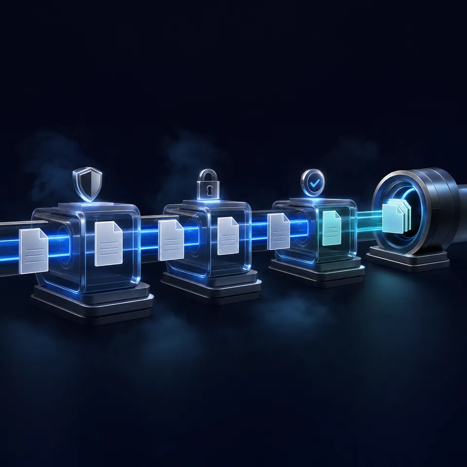
The core problem is architectural. Canva and Piktochart treat infographic creation as a single step: input data, pick a template, tweak the output. OpenClaw agent workflows treat it as a pipeline with discrete stages, where each stage is handled by a specialized skill.
A typical five-stage infographic pipeline:
- Data ingestion: pull CSV, JSON, or spreadsheet data from a source
- Analysis: identify trends, outliers, and key metrics worth visualizing
- Chart generation: render data into specific chart types (bar, scatter, heatmap, Sankey)
- Layout composition: arrange charts, text, and design elements into a cohesive infographic
- Export: produce print-ready PDF, PNG, or SVG files
No single skill covers all five stages equally well. The value of OpenClaw's approach is that each stage can use the best available tool, and the agent handles the handoff between them.
How we evaluated these workflows:
- Output quality: does the final deliverable look professional enough to publish at print resolution?
- Automation depth: how much of the pipeline runs without human intervention?
- Input flexibility: can the workflow accept different data formats and design briefs?
- Skill availability: are the required skills publicly available on ClawHub or open-source repositories?
Every workflow below uses skills that are free, open source, or offer meaningful free tiers. They are ordered from simplest (one skill, one output) to most complex (multi-skill chains with batch production).
Related guides
- How to Build Claude Cowork WorkflowsAgentic workflows handle repetitive data processing, but setting them up requires structure. Learn how to build Claude...
- Best Storage Solutions for Base44 WorkflowsAccording to the Flexera 2025 State of the Cloud Report, 84% of organizations identify managing cloud spend and...
- Top OpenClaw Workflows for AI Print-on-Demand Product Design AutomationThe print-on-demand market hit $12.96 billion in 2025, growing at a 24.81% CAGR, yet most sellers still create designs...
- Best OpenClaw Workflows for AI Interior Design and Room RenderingAI rendering runs 100 to 500 times faster than traditional methods, yet only 20% of design professionals have fully...
- Best OpenClaw Workflows for AI Outfit and Fashion Design GenerationThe AI fashion market is growing at a 41% CAGR, yet most generative design tools still run outside the agent loop....
- Top OpenClaw Workflows for AI Online Course Creation and Curriculum DesignAI tools have cut specific course creation tasks by roughly 50% in time, according to creator surveys cited by Ruzuku,...
More on this subject: OpenClaw Workflows and Integrations (69 guides)
1. ChartGen Data-to-Chart Pipeline
ChartGen is an AI-powered data visualization skill that converts raw datasets into professional charts through natural language commands. It supports over 30 chart types across six categories: comparison (bar, column), trends (line, area), composition (pie, treemap), distribution (scatter, histogram), specialized (funnel, waterfall), and advanced formats (heatmap, Sankey diagram).
How the workflow runs:
The agent ingests a data file in CSV, XLSX, or JSON format. You describe what you want ("show quarterly revenue by region as a stacked bar chart"), and ChartGen selects the visualization type, applies formatting, and exports a high-resolution PNG or SVG.
Key strengths:
- 30+ chart types with AI-recommended visualization selection
- High-resolution PNG and SVG export for print-quality output
- Built-in data analysis with trend detection, anomaly flagging, and statistical summaries
Limitations:
- Focuses on individual charts, not full infographic layouts. You need a separate layout step for composed designs.
- Requires a CHARTGEN_API_KEY environment variable after the initial free credits are used.
Best for: Data-heavy infographics where chart quality matters more than the surrounding layout. Pair ChartGen with Huashu-Design or a code skill for the layout composition stage.
Install: Available on ClawHub. After installation, set the CHARTGEN_API_KEY environment variable to connect to the API.
2. Huashu-Design Print-Grade Infographic Creation
Huashu-Design is the most complete infographic skill in the OpenClaw ecosystem. With 14,800 GitHub stars and an MIT license, it handles the full design pipeline from conversational prompt to print-grade output. The project description captures the idea: "Type. Hit enter. A finished design lands in your lap."
How the workflow runs:
Describe your infographic in natural language. The skill produces HTML-native designs with print-quality typography, then exports to PDF, PNG, or SVG. For data-driven pieces, it generates charts internally. For poster layouts, it applies design philosophy constraints drawn from 20 philosophies across 5 schools, steering output away from the generic look that plagues most AI-generated visuals.
The pipeline runs automatically: the skill parses your prompt, generates three design variations with different aesthetic approaches, applies brand consistency checks through the Core Asset Protocol, renders to HTML with an interactive preview, and exports at print resolution.
Key strengths:
- End-to-end workflow covering data visualization, layout, typography, and export in one skill
- Produces editable PPTX files alongside PDF/PNG, using real text frames rather than image placeholders
- Motion design output for animated infographics with MP4/GIF export and optional background music
- Agent-agnostic: works across Claude Code, Cursor, OpenClaw, Hermes, and other markdown-skill-capable agents
Limitations:
- Turnaround time varies from 3 to 30 minutes depending on design complexity
- Output quality depends heavily on prompt specificity. Vague briefs produce generic results.
Best for: Publication-ready infographics and posters where you need professional layout and typography without opening Figma or Illustrator. The strongest single-skill option when the final output goes to print or a client deliverable.
Install: npx skills add alchaincyf/huashu-design


Store and share your agent-generated infographics in one workspace
Persistent storage with semantic search once Intelligence is enabled, and branded sharing links for client delivery.
3. Excalidraw Diagram Composition
The Excalidraw skill generates hand-drawn-style diagrams from natural language descriptions, exporting as PNG or SVG via the Kroki API or a local CLI. While it was built for technical diagrams, the visual style works well for infographic elements that need a more approachable, less corporate aesthetic.
How the workflow runs:
Describe the diagram structure in plain English. The skill applies a built-in design system with an 8-color semantic palette, a 5-level font hierarchy, and the 60-30-10 whitespace rule. It supports five diagram patterns: flowcharts, architecture maps, sequence diagrams, mindmaps, and swimlanes. Output lands as .excalidraw JSON (fully editable) or rendered PNG/SVG.
Key strengths:
- Hand-drawn aesthetic that differentiates from typical corporate infographic styles
- Built-in design constraints that prevent cluttered or unreadable output
- Zero-install option via the Kroki API, with no local rendering dependencies required
- Multi-agent compatible across OpenClaw, Claude Code, Cursor, Copilot, and Hermes
Limitations:
- Limited to diagram patterns. No support for freeform poster layouts, data charts, or typography-heavy compositions.
- Output needs manual integration into a larger infographic if the diagram is one component of a bigger piece.
Best for: Infographics that feature process flows, architecture overviews, or system maps as visual elements. Pair with ChartGen for data charts and Huashu-Design for the final layout.
Install: Available on ClawHub and via the Agents365-ai/excalidraw-skill GitHub repository.
4. Code Skill Custom Visualization
OpenClaw's built-in code execution lets agents write and run Python scripts using Matplotlib, Plotly, Seaborn, or any visualization library directly. This is the most flexible workflow, trading skill-level convenience for unrestricted customization.
How the workflow runs:
The agent writes a Python script based on your prompt, generates chart images using the library you specify, and saves output files locally. For more complex infographics, the agent can compose multiple chart images into a single layout using PIL/Pillow for image manipulation, or generate an HTML page that serves as the infographic canvas with embedded interactive elements.
Key strengths:
- Unlimited customization. Any chart type, any library, any layout arrangement.
- No external API keys or credit limits. Everything runs locally.
- Can produce interactive HTML visualizations alongside static image exports.
Limitations:
- Requires a Python environment with the relevant visualization libraries installed
- Output quality depends on the agent's code generation. Results are less consistent than purpose-built skills like ChartGen.
- No built-in design system or brand constraints, so visual consistency across outputs requires careful prompting
Best for: One-off infographics with unusual data structures or custom styling requirements that purpose-built skills cannot accommodate. Also useful when you need interactive HTML/JavaScript output rather than static images.
How to Build a Batch Production and Delivery Pipeline
The highest-value workflow chains multiple skills into a repeatable pipeline that produces infographics at scale. Instead of running each skill manually, the agent orchestrates the full sequence and handles file handoff between stages.
A typical batch production chain:
- sheetsmith parses the source data (CSV, XLSX, or database export)
- data-analyst runs aggregations and identifies key metrics
- ChartGen renders individual charts from the processed data
- Huashu-Design composes the charts, text, and branding into a finished infographic
- The agent exports and uploads the final output for review
This pattern works best when you need the same infographic format for different data sets: monthly performance reports, regional comparisons, quarterly investor updates. Define the pipeline once, swap the data source, and the agent produces a new infographic each time. OpenClaw's cron scheduling can trigger batch runs on a daily, weekly, or monthly cadence.
Where finished infographics go:
Local filesystem works for personal projects. For teams that need shared access, version history, and controlled distribution, the output needs a proper home.
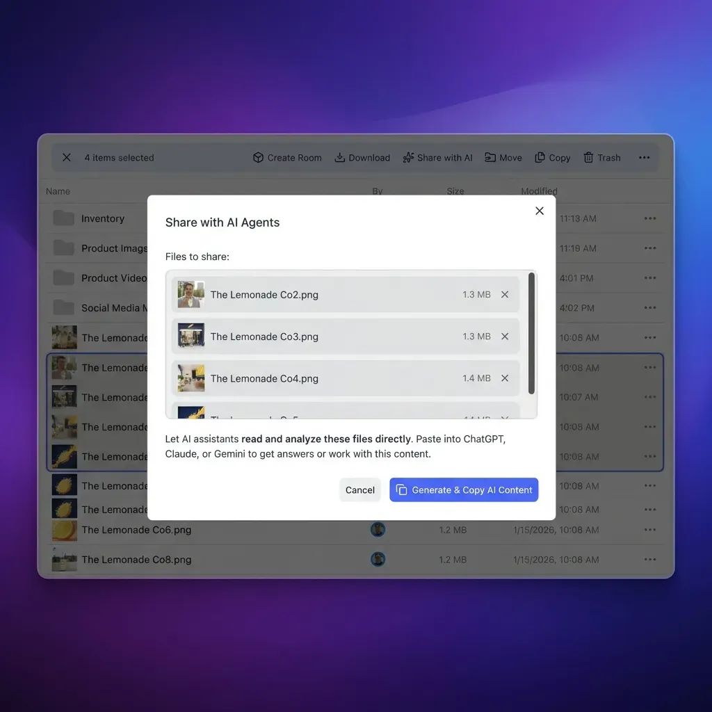
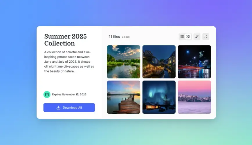
S3 or Google Cloud Storage handles raw file hosting for teams already on AWS or GCP. Google Drive works for smaller operations. Fastio is built for agent workflows: the agent uploads finished infographics to a shared workspace via the MCP server, and once Intelligence is enabled, files are indexed for semantic search. A marketing manager can search "Q1 revenue infographic" and find the right file by content rather than filename. Branded shares let you send a password-protected link to a client without setting up separate hosting.
A 14-day Business Trial is available to test workspaces (credit card required; see pricing). For infographic production, workspaces provide full version history and audit trails.
Which workflow should you choose?
Start with Huashu-Design if you want one skill that handles the full pipeline. Add ChartGen when your infographics are data-heavy and you want finer control over chart types. Use Excalidraw when diagrams are the centerpiece. Drop to a code skill for edge cases where no existing skill fits. Graduate to the batch pipeline when you are producing the same type of infographic repeatedly and want to automate the entire cycle.
Sources
References used to verify factual claims in this guide.
-
Huashu-Design has 14,800 GitHub stars and produces print-grade infographics in 3 to 30 minutes
-
ChartGen supports over 30 visualization types across six categories
-
Excalidraw skill supports 5 diagram patterns with 8-color semantic palette and PNG/SVG export
-
OpenClaw added diagram workflow skills with SVG previews in mid-May 2026
Frequently Asked Questions
Can AI create infographics automatically?
OpenClaw agents create infographics automatically by chaining specialized skills into a pipeline. Huashu-Design handles end-to-end infographic creation from a text prompt, producing print-grade PDF, PNG, or SVG output in 3 to 30 minutes. For data-driven infographics, ChartGen generates individual charts that can be composed into a larger layout. The automation is real, but output quality still depends on prompt specificity.
What OpenClaw skills make posters?
Huashu-Design is the primary poster creation skill, supporting print-quality typography and PDF/PNG/SVG export with design philosophy constraints that prevent generic output. For poster elements like diagrams and flowcharts, the Excalidraw skill generates hand-drawn-style visuals in PNG or SVG format. ChartGen adds data visualization components. Combining these skills gives you the most control over the final poster composition.
How do you generate charts with OpenClaw?
Install the ChartGen skill from ClawHub and set the CHARTGEN_API_KEY environment variable. Then describe the chart you want in natural language, providing a data source in CSV, XLSX, or JSON format. ChartGen supports over 30 chart types and exports high-resolution PNG or SVG files. For simpler needs, OpenClaw's built-in code execution can generate charts using Python libraries like Matplotlib or Plotly.
Can AI design print-ready graphics?
Huashu-Design produces print-ready output in PDF, PNG, and SVG formats at full resolution. The skill applies design philosophy constraints and brand consistency checks that go beyond what template-based tools offer. ChartGen exports charts at print resolution in PNG and SVG. For diagrams, the Excalidraw skill renders SVG output that scales cleanly at any print size.
What is the fast way to make an infographic with OpenClaw?
Huashu-Design is the fast single-skill option, producing a finished infographic in 3 to 30 minutes from a text prompt. For the quickest results, write a specific prompt that includes the data, the visual direction, and the export format you need. Vague prompts produce generic output that requires more iteration. If you only need a data chart rather than a full infographic, ChartGen is faster for individual visualizations.
Related Resources

Store and share your agent-generated infographics in one workspace
Persistent storage with semantic search once Intelligence is enabled, and branded sharing links for client delivery.