Best OpenClaw Workflows for AI Data Visualization
OpenClaw agents can handle the full data visualization pipeline, from pulling raw numbers out of a database to generating charts and delivering finished reports to Slack or email. This guide covers seven workflow patterns that combine OpenClaw skills like ChartGen, sheetsmith, and the dashboard skill into repeatable pipelines. Each pattern includes the tools involved, what it produces, and where the output goes.


Why Agents Change Data Visualization
Traditional data visualization requires a human at every step. You export a CSV, open a spreadsheet or BI tool, build charts manually, format them for stakeholders, and send the report. Each step is a context switch, and the whole process repeats weekly or monthly.
OpenClaw collapses this into a single agent pipeline. You describe what you want in natural language, and the agent handles data ingestion, transformation, chart generation, and delivery. The data visualization market is projected to reach $19.2 billion by 2027, according to Fortune Business Insights, and agentic workflows are a big reason why. Instead of paying per-seat for Tableau or Power BI licenses, a developer can wire up an OpenClaw agent that produces the same output on a schedule.
The workflows below are ordered by complexity. Start with scheduled reports if you want a quick win. Move to multi-source consolidation or anomaly detection once you have the basics running.
Related guides
- How to Set Up Clay Scraper and Data Extraction WorkflowsGo-to-market teams can automate lead generation by building web scraping pipelines directly within Clay. This guide...
- How to Connect Cursor AI to Amazon S3 Buckets for Code and Data WorkflowsCursor S3 integration allows developers using Cursor to connect agent mode directly to Amazon S3 buckets for reading...
- Best OpenClaw Workflows for AI Storyboard and Scene PlanningOver 1 million professionals use AI storyboarding tools, but most require manual interaction per frame. OpenClaw's...
- Best OpenClaw Workflows for AI Social Media Post CreationOpenClaw social media post creation workflows chain content ideation, copy generation, image creation, and...
- Best OpenClaw Workflows for AI Workflow Automation Builder ToolsClawHub's curated index lists 529 skills across its Browser & Automation and Productivity & Tasks categories, yet most...
- Top OpenClaw Workflows for AI Print-on-Demand Product Design AutomationThe print-on-demand market hit $12.96 billion in 2025, growing at a 24.81% CAGR, yet most sellers still create designs...
More on this subject: OpenClaw Workflows and Integrations (69 guides)
1. Scheduled Report Generation
The most common starting point. Your agent pulls data from a source, builds a formatted report with inline charts, and delivers it on a recurring schedule.
Skills involved:
- sheetsmith for CSV and Excel processing
- report-generator for formatted Markdown reports with tables
- Code skill for Python-based chart generation using Matplotlib or Plotly
The agent reads your data file, runs aggregations (totals by region, averages by team, period-over-period changes), generates Python scripts that produce chart images, and wraps everything into a Markdown report. OpenClaw's built-in cron scheduling triggers the workflow at a set time, so Monday morning summaries arrive before your first meeting.
What it produces: A Markdown report with embedded chart images, tables, and bullet-point summaries. Delivered to Slack, Telegram, Discord, or email.
Where to store output: Local filesystem works for single-user setups. For teams that need to review and discuss reports, upload the output to a shared workspace. Fastio indexes uploaded reports automatically through Intelligence Mode, so teammates can search past reports by content rather than filename. Alternatives include S3 for teams already on AWS or Google Drive for smaller operations.
Scheduling tip: OpenClaw's auto-stagger feature prevents rate-limit errors when multiple reports run at the same time. If you have five weekly reports, schedule them at the same cron time and let the agent space them out.
2. CSV-to-Dashboard Pipeline
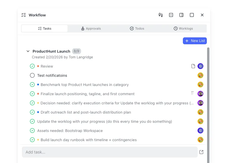
This workflow turns flat data files into a locally hosted dashboard that refreshes automatically.
Skills involved:
- dashboard for static site generation and chart rendering
- sheetsmith for data parsing and transformation
- Code skill for custom data-fetching scripts
The dashboard skill builds a static HTML site that reads from a local data.json file. Your agent runs a data-fetching script on a schedule, updates data.json with fresh numbers, and the dashboard reflects the changes on reload. Each dashboard gets its own port, and a registry.json file tracks health and metadata across all your dashboards.
What it produces: A zero-dependency HTML dashboard with charts and metric cards, served locally. No SaaS subscription required.
Practical use case: An engineering team tracking deployment frequency. The agent queries GitHub for merge counts, calculates weekly velocity, and updates the dashboard. The team bookmarks localhost:3001 and checks it during standups.
For teams that need to share dashboards beyond localhost, you can export the HTML and host it on any static file server. Fastio's branded shares let you send a password-protected link to stakeholders without setting up hosting infrastructure. Netlify or Vercel work too if you prefer a deploy pipeline.


Store and Share Your Agent's Charts and Reports
Generous storage workspace for OpenClaw output. Intelligence Mode indexes reports for search.
3. ChartGen AI for Presentation-Ready Visuals
OpenClaw's built-in charting through Matplotlib produces functional output, but the default styling often needs work before it goes to a client or executive. ChartGen is a dedicated visualization skill that handles the design side.
Skills involved:
- ChartGen (install from ClawHub) for AI-powered chart generation
- sheetsmith or SQL Toolkit for data preparation
ChartGen accepts natural language descriptions like "Create a grouped bar chart comparing Q4 sales vs targets by region with blue and gray colors." It supports over 30 chart types across six categories: comparison charts (bar, stacked bar, column), trend charts (line, area, sparkline), composition charts (pie, donut, treemap), distribution charts (scatter, histogram, box plot), specialized charts (funnel, waterfall, Gantt, radar), and advanced charts (heatmap, combo, Sankey, gauge).
The skill accepts XLSX, CSV, and JSON input formats and exports high-resolution PNG and SVG files. It also runs statistical analysis automatically, calculating averages, medians, distributions, and correlations, then annotating the chart with key findings.
When to use ChartGen vs. raw Matplotlib: Use Matplotlib when you need full control over every axis label and color value, or when the chart is part of a larger Python script. Use ChartGen when you want presentation-ready output without writing plotting code, especially for one-off reports or client deliverables.
ChartGen is available on ClawHub and installs like any other OpenClaw skill through the standard ClawHub registry. It offers free credits for new users, carries an MIT-0 license, and holds a "Benign, High Confidence" security rating on ClawHub. Check the ChartGen product page for current setup instructions and pricing beyond the free tier.
4. SQL-to-Visualization Pipeline
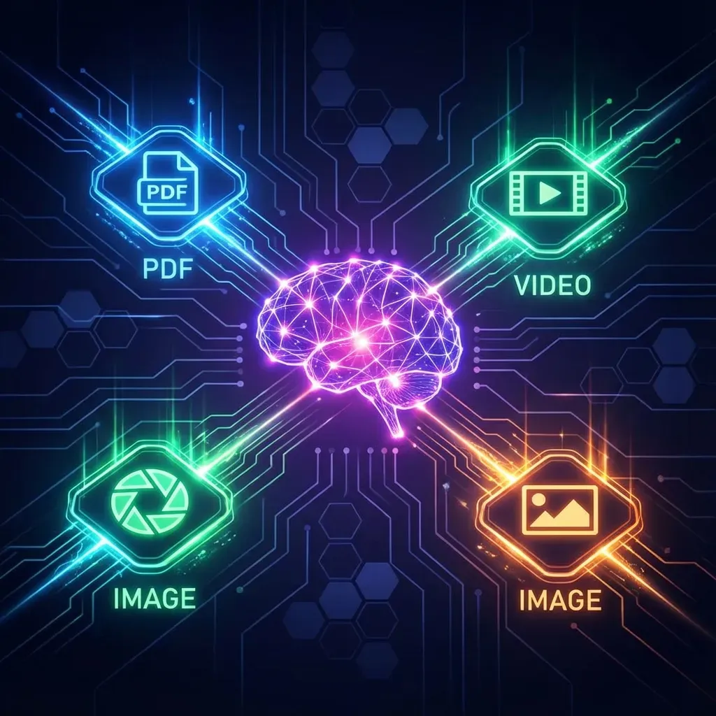
When your data lives in a relational database, this workflow skips the CSV export step entirely. The agent queries the database, processes results, and generates charts in one pass.
Skills involved:
- SQL Toolkit for database queries across SQLite, PostgreSQL, and MySQL
- ChartGen or Code skill for chart generation
- report-generator for wrapping charts into a formatted report
You tell the agent something like "Show me monthly revenue by product line for the last four quarters as a stacked area chart." The SQL Toolkit translates that into a parameterized query with proper escaping (preventing injection attacks), runs it against your database, and passes the result set to ChartGen or a Matplotlib script.
The SQL Toolkit supports complex operations: window functions, CTEs, recursive queries, and EXPLAIN analysis for performance tuning. This means your agent can handle sophisticated analytical queries, not just simple SELECTs.
What it produces: Charts generated directly from live database queries, with optional Markdown report wrapping.
Data freshness advantage: Unlike CSV-based workflows where data goes stale the moment you export it, SQL-to-viz pipelines always pull current numbers. Schedule the agent to run before a meeting and the charts reflect data as of that moment.
For teams that want to archive query results alongside the generated charts, uploading both to a workspace keeps an audit trail. Fastio's Metadata Views can extract structured fields from uploaded reports, turning a folder of weekly chart PDFs into a searchable, sortable table of metrics over time.
5. Anomaly Detection with Visual Alerts
This workflow monitors metrics continuously and generates charts only when something unusual happens. Instead of producing daily reports that nobody reads, the agent watches for statistical outliers and sends a visualization that highlights the problem.
Skills involved:
- alerts skill for anomaly monitoring against statistical baselines
- ChartGen or Code skill for generating the alert visualization
- sheetsmith for data ingestion from CSV or JSON feeds
The alerts skill compares incoming metrics against a rolling baseline (typically a 7-day average). When a value exceeds the threshold, the agent generates a chart showing the anomaly in context, with the baseline, the deviation, and recent trend lines. It then routes the alert based on severity: critical issues go to SMS, Slack, or Telegram immediately, while low-priority anomalies get batched into an email digest.
Deduplication matters: The alerts skill prevents notification fatigue by deduplicating repeated anomalies. If your API error rate spikes and stays elevated, you get one alert with an updating chart, not fifty identical notifications.
Practical use case: An e-commerce team monitoring conversion rates. The agent checks hourly, and when the rate drops below two standard deviations from the weekly mean, it generates a line chart showing the decline, annotates the likely start time, and posts to the team's Slack channel.
6. Multi-Source Data Consolidation
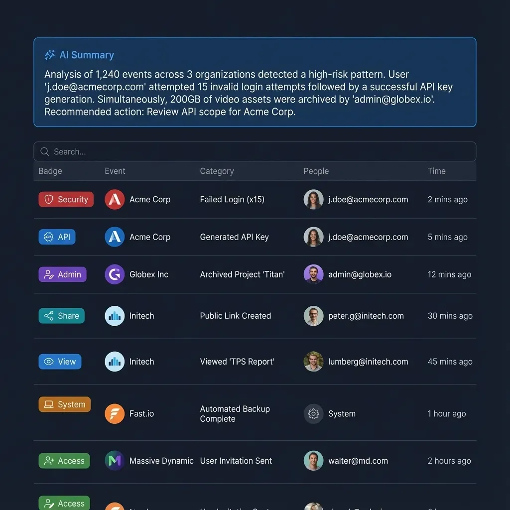
Real reporting rarely comes from a single source. This workflow pulls data from multiple systems, normalizes it, and produces a unified visualization.
Skills involved:
- SQL Toolkit for database sources
- Playwright for scraping web dashboards that lack APIs
- sheetsmith for CSV and Excel files
- data-quality-check for validation across sources
- ChartGen or dashboard for the final visualization
The agent collects data from each source in parallel, runs quality checks (looking for nulls, format inconsistencies, and missing values), normalizes everything into a common schema, and then generates the combined visualization. The data-quality-check skill validates across five dimensions before the chart is produced, so you catch problems at ingestion rather than after the report ships.
Example pipeline: A marketing team consolidating ad spend from Google Ads (CSV export), website traffic from an analytics dashboard (Playwright scrape), and conversion data from a PostgreSQL database (SQL Toolkit query). The agent merges these into a single funnel chart showing spend-to-conversion ratios by channel.
Delivery options: Push the consolidated report to Slack for immediate team review. For long-term storage and searchability, upload to Fastio where Intelligence Mode indexes the content for natural language queries. A teammate can later ask "What was our Google Ads conversion rate in March?" and get the answer pulled from the archived report. Google Drive or Notion work for teams that prefer those ecosystems, though they lack the built-in semantic search layer.
Scheduling: Run consolidation workflows on a weekly or monthly cadence using OpenClaw's cron jobs. Daily runs work for operational dashboards, but executive reports benefit from a less frequent schedule that smooths out noise.
How to Choose the Right Workflow for Your Data
Start with the workflow that matches your most painful manual process. If you spend Monday mornings building reports, begin with scheduled report generation. If executives keep asking for custom charts, set up ChartGen with natural language prompts.
A few guidelines for picking your starting point:
- Single data source, recurring schedule: Workflow 1 (Scheduled Reports) or Workflow 2 (CSV-to-Dashboard)
- Client-facing or executive presentations: Workflow 3 (ChartGen AI) for polished output
- Live database queries: Workflow 4 (SQL-to-Visualization) for always-current charts
- Monitoring and alerting: Workflow 5 (Anomaly Detection) for exception-based reporting
- Multiple data sources: Workflow 6 (Multi-Source Consolidation) for unified views
Most teams end up combining two or three of these. A common pattern is SQL-to-viz for daily operational charts, ChartGen for monthly board reports, and anomaly detection running continuously in the background. OpenClaw's skill system makes it straightforward to install what you need and add more as your pipelines mature.
All of these workflows produce files: chart images, HTML dashboards, Markdown reports, PDFs. The question is where those files live after generation. For solo developers, the local filesystem is fine. For teams, persistent cloud storage with search and sharing saves time. Fastio offers a 14-day Business Trial (card required; see /pricing/) to run shared visualization pipelines.
Sources
References used to verify factual claims in this guide.
-
Data visualization market projected to reach $19.2 billion by 2027
-
ChartGen supports 30+ visualization types across six categories including comparison, trend, composition, distribution, specialized, and advanced charts
-
OpenClaw has 163,000 GitHub stars and a marketplace of 5,700+ community-built skills
Frequently Asked Questions
How do you create data visualizations with OpenClaw agents?
Install a visualization skill like ChartGen or the Code skill from ClawHub. Then describe the chart you want in natural language, provide your data as a CSV, XLSX, or JSON file, and the agent generates the visualization. For database sources, add the SQL Toolkit skill so the agent queries your data directly before charting it.
What OpenClaw skills generate charts and dashboards?
The main options are ChartGen (30+ chart types with AI-powered styling), the dashboard skill (locally hosted HTML dashboards), and the Code skill (custom Matplotlib or Plotly scripts). ChartGen is best for presentation-ready output, the dashboard skill for live-updating metric pages, and the Code skill for full programmatic control.
Can OpenClaw agents automate report generation with visualizations?
Yes. Combine sheetsmith (data processing), a charting skill (ChartGen or Code), and report-generator (formatting) with OpenClaw's built-in cron scheduling. The agent runs on a schedule, pulls fresh data, generates charts, wraps them in a Markdown report, and delivers to Slack, email, or a shared workspace.
What data formats does OpenClaw support for visualization?
OpenClaw skills accept CSV, XLSX, and JSON files for data input. The SQL Toolkit adds support for querying SQLite, PostgreSQL, and MySQL databases directly. The Playwright skill can scrape data tables from web pages that lack export options.
How does Fastio help with OpenClaw data visualization workflows?
Fastio provides persistent storage and searchability for the charts, reports, and dashboards that OpenClaw generates. Intelligence Mode indexes uploaded files automatically, so team members can search past reports by content. The MCP server gives agents direct access to upload, organize, and share output without manual file management.
Is ChartGen free to use with OpenClaw?
ChartGen offers free credits for new users and is licensed under MIT-0. Install it from ClawHub and configure an API key from the ChartGen.ai dashboard. Pricing beyond the free tier depends on volume, so check their pricing page for current rates.
Related Resources

Store and Share Your Agent's Charts and Reports
Generous storage workspace for OpenClaw output. Intelligence Mode indexes reports for search.