How to Choose Marketing Dashboard Software for Data-Driven Teams
Marketing dashboard software pulls campaign metrics from dozens of platforms into one view so teams can spot what is working and cut what is not. This guide covers the features that actually matter when choosing a dashboard, the metrics worth tracking, and how to connect reporting insights back to your content and asset production pipeline.

What Marketing Dashboard Software Actually Does
Marketing dashboard software consolidates campaign metrics, channel performance, and ROI data into visual reports that help teams make faster, evidence-based decisions.
Most marketing teams pull data from Google Ads, Meta, LinkedIn, email platforms, CRM, and organic search tools. Without a dashboard, reporting means logging into each platform, exporting spreadsheets, and stitching numbers together manually. That process eats hours every week and the resulting report is already stale by the time it reaches a stakeholder.
Dashboard software solves this by connecting to each data source through APIs, normalizing the metrics, and displaying them in a single interface. The best tools update in near real-time, so you see campaign performance as it happens rather than in yesterday's export.
There is a meaningful difference between a marketing dashboard and a marketing analytics platform. Analytics platforms like GA4 or Mixpanel collect and process raw event data. Dashboards sit on top of that data and visualize it. Some tools, like HubSpot, bundle both. Others, like Databox or Klipfolio, are pure visualization layers that pull from your existing analytics stack.
The practical test: if your team spends more than an hour per week assembling reports from different platforms, a dedicated dashboard will pay for itself in the first month.
Helpful references: Fastio Workspaces, Fastio Collaboration, and Fastio AI.
What to check before scaling marketing dashboard software
Every marketing dashboard can display a chart. The features below are what separate tools you will actually use from tools that collect dust after the first quarter.
Multi-channel data connectors
The number of native integrations matters less than whether the tool connects to your specific stack. Check for connectors to your ad platforms, email tool, CRM, and web analytics before evaluating anything else. Tools like Funnel.io and Supermetrics specialize in this data plumbing and can feed cleaned data into any visualization layer.
Data transformation and blending
Raw metrics from different platforms use different definitions. Facebook counts a "click" differently than Google. Good dashboards let you normalize, rename, and combine metrics so your team works from a single source of truth. Klipfolio and Power BI are strong here.
Custom report builders
Pre-built templates get you started, but every team tracks slightly different KPIs. Look for drag-and-drop report builders that let non-technical marketers create their own views without waiting on an analyst.
Automated scheduling
The best report is the one people actually read. Automated email delivery on a weekly or monthly cadence puts numbers in front of stakeholders without anyone remembering to send them.
Attribution modeling
Last-click attribution is dying. Multi-touch attribution models that credit every touchpoint in the buyer journey give you a more accurate picture of what is driving conversions. Tools like Cometly focus specifically on this problem with server-side tracking that survives cookie restrictions.
Team sharing and collaboration
Dashboards locked in one person's account are useless. Shared views, commenting, and role-based access let the whole team work from the same numbers.
Metrics Worth Tracking on Your Marketing Dashboard
Marketing teams track an average of 15 or more KPIs across channels. That does not mean your dashboard should display all of them at once. The goal is 5 to 10 metrics per view, organized by the question you are trying to answer.
Acquisition and cost metrics
- Customer Acquisition Cost (CAC): total spend divided by new customers acquired
- Cost Per Lead (CPL): spend divided by leads generated, broken down by channel
- Return on Ad Spend (ROAS): revenue attributed to ads divided by ad spend
Revenue and pipeline metrics
- Marketing-sourced revenue: deals where the first touch came from a marketing channel
- Customer Lifetime Value (LTV): projected revenue from a customer over their relationship
- LTV-to-CAC ratio: anything below 3:1 suggests your acquisition costs are too high
Engagement metrics
- Conversion rate by channel and funnel stage
- Click-through rate on ads, emails, and CTAs
- Bounce rate and session duration for content pages
Content performance metrics
- Organic traffic by landing page
- Keyword rankings for target terms
- Content-attributed conversions: which blog posts or guides actually drive pipeline
The trick is connecting these metrics across the funnel. A dashboard that shows CPL alongside content-attributed conversions reveals whether your cheapest leads are also your highest-quality ones. That connection is where dashboard software earns its keep.


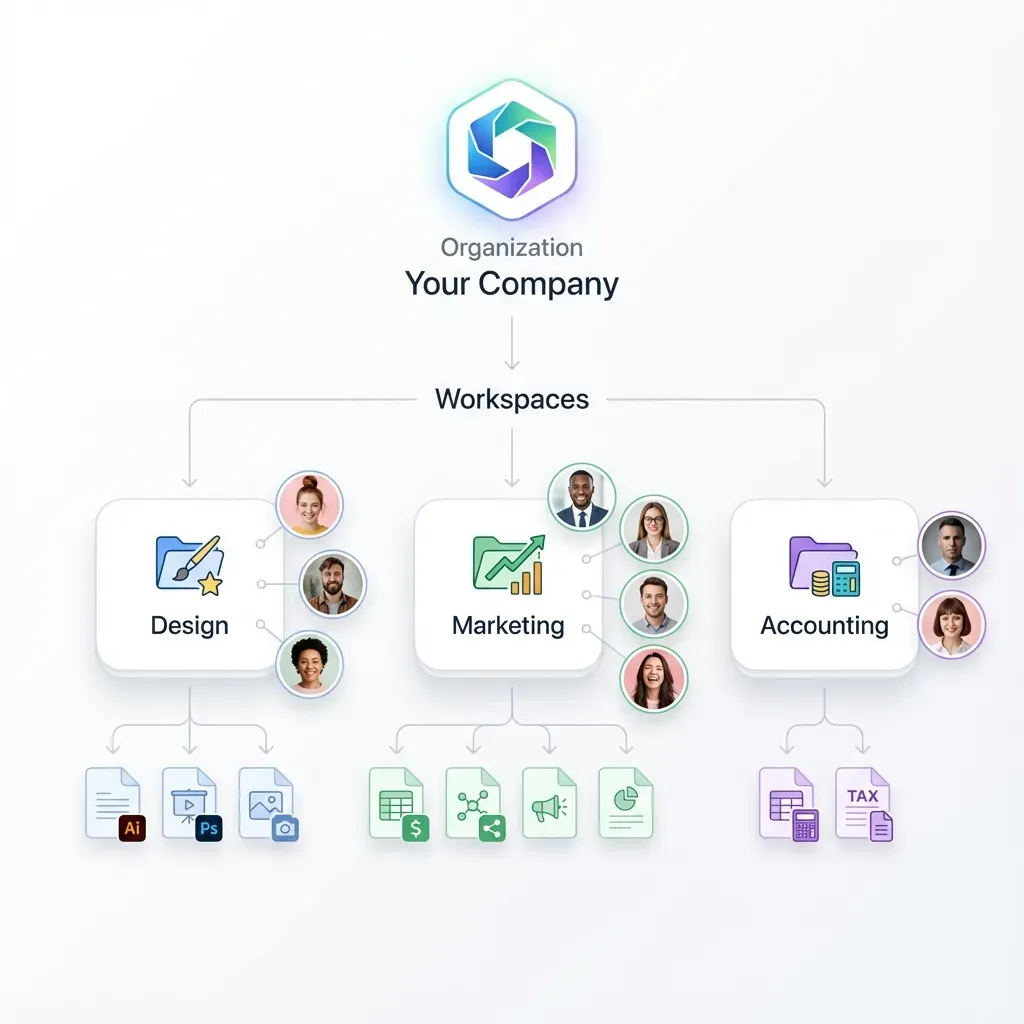
Centralize your campaign assets alongside your dashboard data
Fastio workspaces give your marketing team shared access to campaign files, brand assets, and creative deliverables with built-in search and granular permissions. Free for up to 50GB. Built for marketing dashboard software workflows.
Top Marketing Dashboard Tools Compared
Here is a practical comparison of the tools worth evaluating, organized by what they do best.
HubSpot Marketing Hub
Built-in dashboards that pull from HubSpot's own CRM and marketing tools. If you already run campaigns through HubSpot, the reporting is smooth because the data never leaves the platform. The limitation: it only covers HubSpot data natively. You will need third-party connectors for non-HubSpot ad platforms.
Databox
Connects to over 100 data sources including GA4, HubSpot, Facebook Ads, and Shopify. Strong mobile dashboards for checking metrics on the go. The free tier covers three data sources, which is enough to evaluate.
Klipfolio
Best for teams that need to blend data from multiple sources. The formula engine lets you create calculated metrics that combine data from different platforms. Steeper learning curve, but more flexible than template-driven tools.
Whatagraph and AgencyAnalytics
Both built for agencies that need white-label client reporting. AgencyAnalytics supports over 80 integrations and automated report scheduling. Whatagraph leans harder into drag-and-drop design. Pick based on whether your priority is integration depth or report aesthetics.
Tableau and Power BI
Enterprise BI tools that handle marketing dashboards as one use case among many. Tableau excels at complex visualizations and forecasting. Power BI is cheaper and integrates tightly with the Microsoft ecosystem. Both require more setup than marketing-specific tools but scale better for large organizations.
DashThis
The simplest option on this list. Template-driven dashboards that connect to major ad platforms and analytics tools. Limited customization, but fast to set up and easy for non-technical team members.
Funnel.io
Not a dashboard itself, but a data hub that collects, normalizes, and routes marketing data to any visualization tool. If you want Tableau's visualization power with data from 500+ marketing platforms, Funnel.io is the plumbing layer that makes it work.
Connecting Dashboard Insights to Your Content Pipeline
Most guides on marketing dashboard software stop at "pick a tool and connect your data." They skip the harder question: what do you do after you see the numbers?
Dashboard insights should feed directly back into your content and campaign asset decisions. If your dashboard shows that video content drives 3x more conversions than static posts, your content team needs to know that before they plan next month's calendar. If a landing page has high traffic but low conversion, the design team needs the page file, performance data, and revision history in one place.
This is where the gap between reporting tools and operational workflows becomes painful. Your dashboard lives in one tab. Your campaign assets live in Google Drive or Dropbox. Your project briefs live in a PM tool. Performance feedback takes days to reach the people who create the assets.
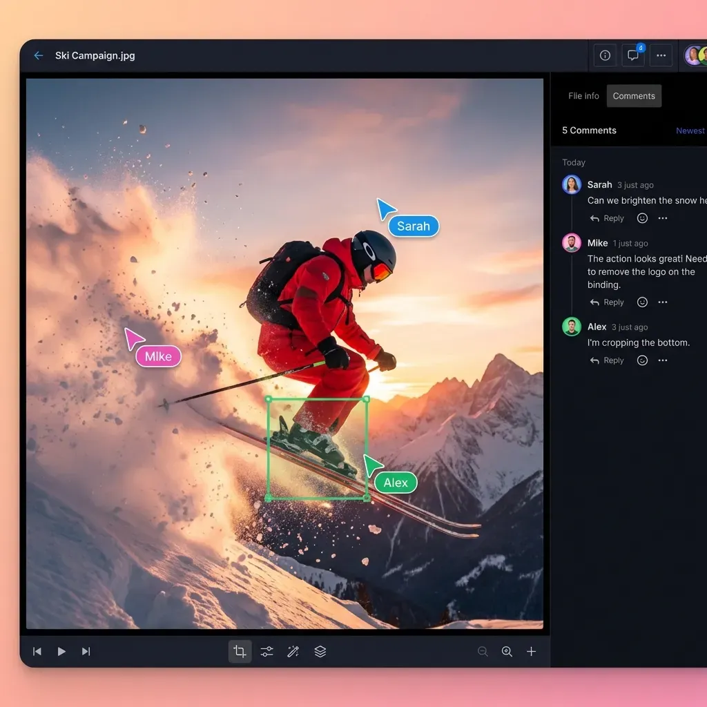
Teams that close this loop faster tend to centralize campaign assets in a shared workspace where everyone, from analysts to designers, can access both the files and the context around them. When your dashboard flags a high-performing ad creative, the original source file should be one click away, not buried in someone's local folder.
Fastio workspaces are built for this kind of cross-functional access. Campaign assets, brand guidelines, and creative files live in shared workspaces with granular permissions, so the analytics team can see what was published while the design team controls who edits the source files. Intelligence Mode auto-indexes uploaded files for semantic search, so when someone asks "which Q1 campaign creative performed best," the answer connects dashboard metrics to the actual asset files.
For teams managing large volumes of marketing assets, the combination of a dedicated dashboard tool for visualization and a shared workspace for asset context covers both sides of the feedback loop.
Setting Up Your First Marketing Dashboard
Start with what you already have. You do not need to buy new software before building your first useful dashboard.
Step 1: Audit your data sources
List every platform where your marketing data lives. For most teams, this includes an ad platform (Google Ads, Meta Ads), an email tool (Mailchimp, HubSpot), web analytics (GA4), and a CRM (HubSpot, Salesforce). Count the platforms. If you have fewer than three, a spreadsheet might be enough. More than three, and a dashboard tool will save real time.
Step 2: Define your reporting cadence
Who sees the dashboard, and how often? Executive stakeholders might need a monthly summary with CAC and revenue metrics. Campaign managers need daily views of ad spend and conversion rates. Build different views for different audiences rather than cramming everything into one screen.
Step 3: Start with a template, then customize
Every dashboard tool ships with marketing templates. Use one as a starting point, then remove metrics nobody looks at and add the ones your team actually discusses in meetings. The dashboard should answer the questions your team already asks, not create new ones.
Step 4: Automate delivery
Set up weekly email reports for stakeholders who will not log into the dashboard themselves. This is the single highest-ROI feature in any dashboard tool because it ensures the data actually reaches decision-makers.
Step 5: Connect to your asset workflow
When the dashboard reveals a winning campaign or a failing landing page, make sure the path from insight to action is short. Store campaign assets in a shared workspace like Fastio where the content team, design team, and analytics team all have access. Branded shares let you package performance reports alongside the actual creative files and send them to clients or stakeholders in a single link, with download tracking and audit trails built in.
Step 6: Review and prune quarterly
Dashboards accumulate metrics like closets accumulate clutter. Every quarter, review each metric on the dashboard and ask whether anyone made a decision based on it in the last 90 days. If not, remove it. A focused dashboard with 8 metrics beats a cluttered one with 30.

Frequently Asked Questions
What is the best marketing dashboard software?
It depends on your stack and team size. HubSpot is best if you already use their CRM. Databox works well for small teams that need quick multi-channel views. Klipfolio suits teams that need custom calculated metrics. Tableau and Power BI are better for enterprises with complex data blending needs. For agencies, AgencyAnalytics and Whatagraph offer white-label client reporting.
How do you create a marketing dashboard?
Start by listing your data sources (ad platforms, email tools, CRM, web analytics). Choose a dashboard tool that connects to those sources. Use a pre-built marketing template as a starting point, then customize it to show the 5 to 10 metrics your team actually reviews in weekly meetings. Set up automated email delivery so stakeholders see the report without logging in.
What metrics should a marketing dashboard track?
Focus on metrics tied to business outcomes: Customer Acquisition Cost, Cost Per Lead, Return on Ad Spend, conversion rates by channel, and marketing-sourced revenue. Add engagement metrics like click-through rate and bounce rate for tactical views. Keep each dashboard view to 5 to 10 metrics. More than that and nobody reads it.
What is the difference between marketing analytics and a marketing dashboard?
Marketing analytics platforms like GA4 or Mixpanel collect and process raw event data. A marketing dashboard visualizes that processed data in charts, tables, and KPI widgets. Some tools like HubSpot bundle both. Others like Databox or Klipfolio are pure visualization layers that connect to your existing analytics tools.
How much does marketing dashboard software cost?
Prices range from free (Databox free tier, Google Looker Studio) to several hundred dollars per month for enterprise tools. Databox starts free for three data sources. DashThis starts around published pricing. AgencyAnalytics starts around published pricing. Tableau and Power BI are priced per user, typically $10 to published pricing depending on the edition.
Related Resources

Centralize your campaign assets alongside your dashboard data
Fastio workspaces give your marketing team shared access to campaign files, brand assets, and creative deliverables with built-in search and granular permissions. Free for up to 50GB. Built for marketing dashboard software workflows.